The WESOUND Morse Code
BETTER SOUND 2022 | Category: Audio Branding
Entrant
WESOUND GmbH
Abstract
We are WESOUND. We are one of the few audio branding agencies in the world with our own unique sound logo system. In harmony with our visual brand identity, we created a concept-emphasised, fluid and ever-changing sound design, to celebrate our clients and designers. It is the WESOUND Morse Code.
Description
Companies need audio branding. Period. Funny how audio branding agencies in particular tend to have pretty quiet brands. It’s exactly the kind of problem you push back and forth on the prio list with a grudging “yeah, I know”. So did we. That was our motivation to change that.
The very problem of creating an audio branding for an audio branding agency, however, is this: How can you create some sort of super-design? Obviously, you must aim higher than great because you need your clients to think, wow… that’s something, right? On top of that, how can we channel our creative urges and not be tied down by a fixed and always same sound design? Would it also be possible to thus celebrate our clients and our designers and create new challenges every day?
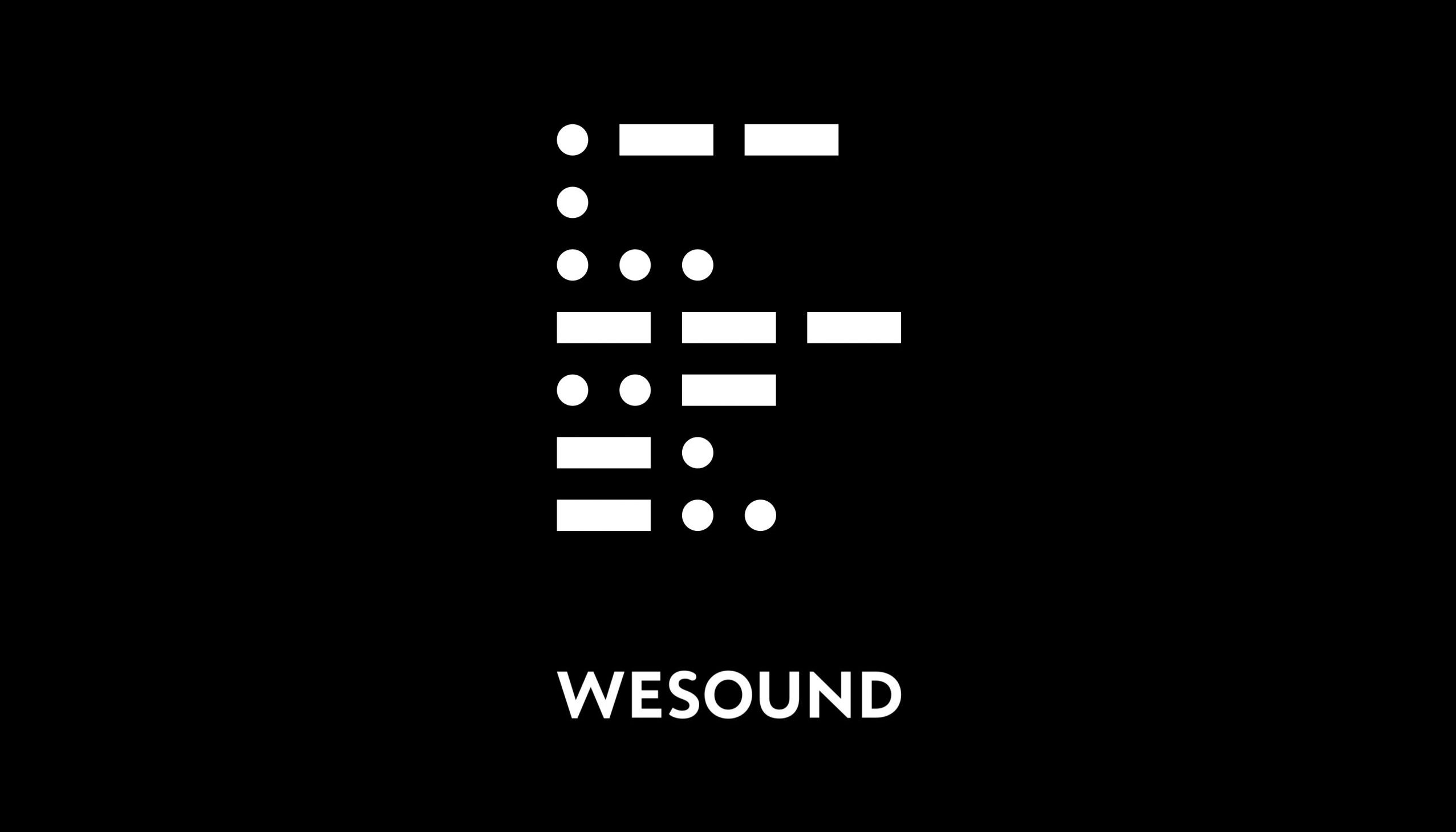
Our answer to this lies both in creative concept and artistic execution. Wesound’s visual logo is based on Morse code. Morse code because it is an almost archetypal translation of language, of meaning; raw, and reduced to the essential. Just like our work. The sound to it is obvious: it’s Morse beeps. Each line of Morse code represents one letter of our name, W (.–), E (.), S (…), O (—), U (..-), N (-.), D (-..). Of course you can knock yourself out and play the sequence with a moog synthesizer (“modern”!) or a piano (“trustful”!!) or even an orchestra (“sophisticated”!!!). But this wouldn’t answer to our challenge: to create a concept-emphasised, fluid and ever-changing super-design, that celebrates our clients and designers.
But this concept does the trick: We create a new Wesound sound logo for every new client. The rules are simple. First, the sound logo must either maintain the morse code rhythm or its linguistic meaning – either you design with the rhythm or you work with the letters or the word Wesound itself. Second, the sound needs to capture the essence of the client’s brand. That’s it.
This has led, for example, to this interpretation for the Discovery Dock. For our award-winning work for Hamburg’s multimedia harbour museum, real Morse tones from the 1940s provide the cultural framework for its bold look into the future. For Duden, we used raw computer-generated voice to show the brand’s devotion to structure. For ISA we used the ISA bell we have won for the Discovery Dock.
With this sound logo system we created a concept-emphasised, fluid and ever-changing super-design, to celebrate our clients and designers. Certainly, this sound logo concept will not make the world know our brand. But memorability is only one aspect of branding; for our own branding the message is key. Whether we are showing our ever new sound logo at the beginning or end of a case study video, a client project recap presentation, a website or social media stream – one thing remains constant: we provide a creative insight into our way of thinking and working. Our position: Branding is a most individual matter, and there is no singular solution to a creative problem. There are many, and we share them with you!